Google’s Material Design is a comprehensive design language intended to be both beautiful and functional across all resolutions and devices, so it’s a perfect match for WordPress theme developers who want to create modern responsive designs without having to reinvent the wheel. 34SP.com WordPress Hosting is providing this article to help those who want to explore Material Design in depth. In this tutorial, we’re going to use Materialize to build a fully functional Material Design powered theme that looks like this:

To begin with, we’re going to generate a blank theme from Underscores. For those not familiar, Underscores is an essentially blank starter theme from Automattic, the company that created WordPress. It allows you to generate the basic files needed to create a theme, all namespaced according to your input. For anyone doing theme development, it’s a big timesaver. Give your theme a name, and click “Generate”. This will result in a zip file download containing your theme files.

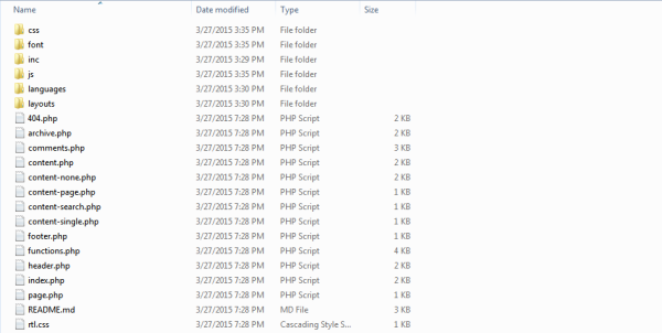
Next, download the Materialize package, and extract both zip files into your working directory. (Note: Materialize supports both NPM and Bower, and also supports SASS development. This tutorial will cover traditional CSS, but if you prefer SASS, visit the Materialize Getting Started page and grab the SASS supported package). In the Materialize folder, you’ll see three directories: css, font, and js. Copy all three to your new theme directory. This should leave you with a directory structure that looks like this:

Next, we need to add the scripts and styles from Materialize into our theme. Open up the functions.php, and find your enqueue function. If you’ve been following along exactly, it should start on line 102. Because we’re going to be using the Material based navigation, you’ll want to remove the following line in that function:
wp_enqueue_script( 'yourthemename-navigation', get_template_directory_uri() . '/js/navigation.js', array(), '20120206', false );
Delete the associated script (js/navigation.js), and create a new file called material-custom-scripts.js in the same directory to hold your custom JavaScript. Add the following code to it:
jQuery(document).ready(function ($) {

  $('.button-collapse').sideNav({
      menuWidth: 300, // Default is 240
      edge: 'left', // Choose the horizontal origin
      closeOnClick: true // Closes side-nav on <a> clicks, useful for Angular/Meteor
    }
  );


});
This initializes the JQuery needed to trigger the side sliding navigation for mobile. We need to use a newer version of JQuery than what is bundled in WordPress, so we’re going to setup a conditional load of JQuery when not in the admin screens, and then enqueue our scripts and styles:
	// Add Material scripts and styles
	if( !is_admin()){

		wp_deregister_script('jquery');
		wp_enqueue_script( 'material-jquery', 'http://code.jquery.com/jquery-2.1.3.min.js', array(), '1.0', false );

	}
	wp_enqueue_style( 'material-style', get_template_directory_uri() . '/css/materialize.css' );
	wp_enqueue_script( 'material-script', get_template_directory_uri() . '/js/materialize.js', array(), '1.0', false );
	wp_enqueue_script( 'material-custom', get_template_directory_uri() . '/js/material-custom-scripts.js', array(), '1.0', false );
Next we need to make some changes to the theme header file. First, open header.php and modify the viewport settings to make sure that users don’t have the ability to artificially zoom the screen and break our mobile patterns:
<meta name="viewport" content="width=device-width, initial-scale=1.0, maximum-scale=1.0, user-scalable=no"/>
Then, we need to modify the navigation calls to use our side nav on mobile. Find and replace this:
<nav id="site-navigation" class="main-navigation" role="navigation">
	<button class="menu-toggle" aria-controls="primary-menu" aria-expanded="false"><?php _e( 'Primary Menu', 'materialized' ); ?></button>
	<?php wp_nav_menu( array( 'theme_location' => 'primary', 'menu_id' => 'primary-menu' ) ); ?>
</nav><!-- #site-navigation -->
With this:
<div class="m-container nav">
	<div class="container">
		<nav id="site-navigation" class="main-navigation" role="navigation">
			<a href="#" data-activates="mobile-nav" class="button-collapse"><i class="mdi-navigation-menu"></i></a>

			<?php wp_nav_menu( array( 'theme_location' => 'primary', 'menu_class' => 'menu side-nav', 'menu_id' => 'mobile-nav','items_wrap' => '<ul id="%1$s" class="%2$s"><li class="mobile-header"><p>Menu</p></li>%3$s</ul><div class="clear"></div>', ) ); ?>

			<?php wp_nav_menu( array( 'theme_location' => 'primary', 'menu_class' => 'hide-on-med-and-down' ) ); ?>

		</nav><!-- #site-navigation -->
	<div class="clear"></div>
  </div>
</div>
This accomplishes a couple of things:
- It wraps the nav in a stand alone container we’ll use for styling.
- It attaches the data-activates attribute, which Jquery will use to trigger the mobile menu.
- It wraps the menu items as needed to use the Material display.
- It adds a second iteration of the menu which is hidden on Medium size and down, which is when the slide out menu is displayed.
We also need to add a wrapper to float our content to a centered fix width in full screen displays. At the very last line of header.php, add the following:
<div class="container">
Open your footer.php, clear any stray floats, and close the container (add above the content closing div):
<div class="clear"></div>
</div><!-- .container -->
Next, let’s add some CSS to support some of the elements we’ve just put in place. Open up your style.css, and add the following:
.container {
	padding: 0 .5rem;
	margin: 0 auto;
	max-width: 1280px;
	width: 100%;
}
I selected 1280px as a max-width based on what I’ve seen Google use in their various applications for a 1920×1080 resolution. You may want to modify that based on your individual needs. Next, we need to modify the default menu styles in a few ways. The default mobile styles which control menu visibility need to be removed. Find and delete the following:
/* Small menu. */
.menu-toggle {
	display: none;
}

@media screen and (max-width: 600px) {
	.menu-toggle,
	.main-navigation.toggled .nav-menu {
		display: block;
	}

	.main-navigation ul {
		display: none;
	}
}
Next, we need to over ride the default material treatment for the nav element, since we’re going to be styling the containing div instead:
.m-container nav {
  color: #fff;
  background-color: transparent;
  width: 100%;
  height: 56px;
  line-height: 56px;
  overflow: hidden;
  box-shadow: 0 0 0;
}
And let’s add a little padding around the site title to bring it in from the edges:
.site-branding {
  padding: 20px 30px;
}
At this point, you have all of the basics in place to run the theme. Load it up in your staging area and view it in the browser. You should see something like this:

It’s not pretty yet, but we’re now ready to begin the process of making it both beautiful and interactive. In part 2, we’re going to use the Theme Customization API to add colour options to our theme, allowing the user to select from one of several palettes based on the Material Design colour schema. We’ll also implement Material UI elements, including Card objects, collections, and transition effects.
See something in here that could be done better? Tell us about it in the comments.


